Advanced tolerances - Introduction
Attempting to define an acceptable tolerance (deviation) from the desired reference is a difficult process because the color is not linear and it is very subjective. The first reaction is to define a tolerance by declaring a certain ∆E, but as good as ∆E (00) is, there are many colors where ∆E does not sufficiently qualify the deviation in all color directions. ChromaChecker has a tool called Spot Color Variator which visually shows the problem related to defining an ∆E (2000) tolerance scheme to colors.
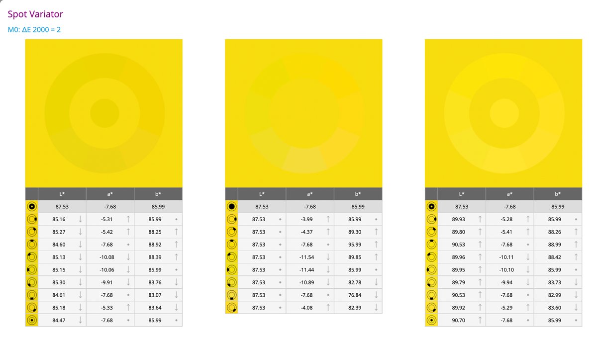
Spot Variator (part of the color sample report in Assets) is a simple feature that is simulating what visual boundaries of the defined color tolerance. The picture in the middle is with a perfect L value - color hues are hard to see, while the L difference is perceived as strong.
Some ∆E values related to colors react worse than others due to the nonlinearity of color and where the color is in the color space. To overcome this limitation, ChromaChecker has introduced the Snowflake Tool. The Snowflake tool allows a user to define the acceptable color tolerance in each color axis independent of one another (essentially 3 times more accurate than ∆E00) and can help determine if your print process is capable of achieving this level of tolerance.
There are situations in printing production when the traditional tolerance description system fails. The value of the accepted error expressed by the ∆E formula for some colors seems to be mismatched and it works both ways, some differences are too big, and others may have been smaller. Very often we have a situation when observing what the boundary values look like for a given tolerance value, most often, especially for fairly saturated colors, the change of tone determined by the a and b axes is more acceptable than the change of brightness (L axis). It also happens that we are willing to accept slightly larger deviations for the b axis than for the a-axis. This is because the b axis corresponds to the color temperature - and this is the subject of the compensation that our brain performs when the white color changes with the times of the day. Chromatic adaptation has taught us to understand subconsciously the swing between yellow and blue. Man, his brain interprets changes on the green/magenta axis differently. Here the brain pays completely different attention to the swing of color which it tries to read other meanings culturally inscribed in our system of interpretation. When we see a greenish or magenta color on the face, it is a sign of a disease for the brain - we are sensitive to such a signal. Similarly, our ability to interpret such colors on food - is a subconscious warning that what we are looking at is potentially poisonous, and unhealthy for us. Memory colors, which are the basis of the ability to remember a color, have some kind of internal tolerance mechanisms assigned by nature.
Methodology
- In most scenarios, starting from on-screen evaluation may be faster and will save consumables
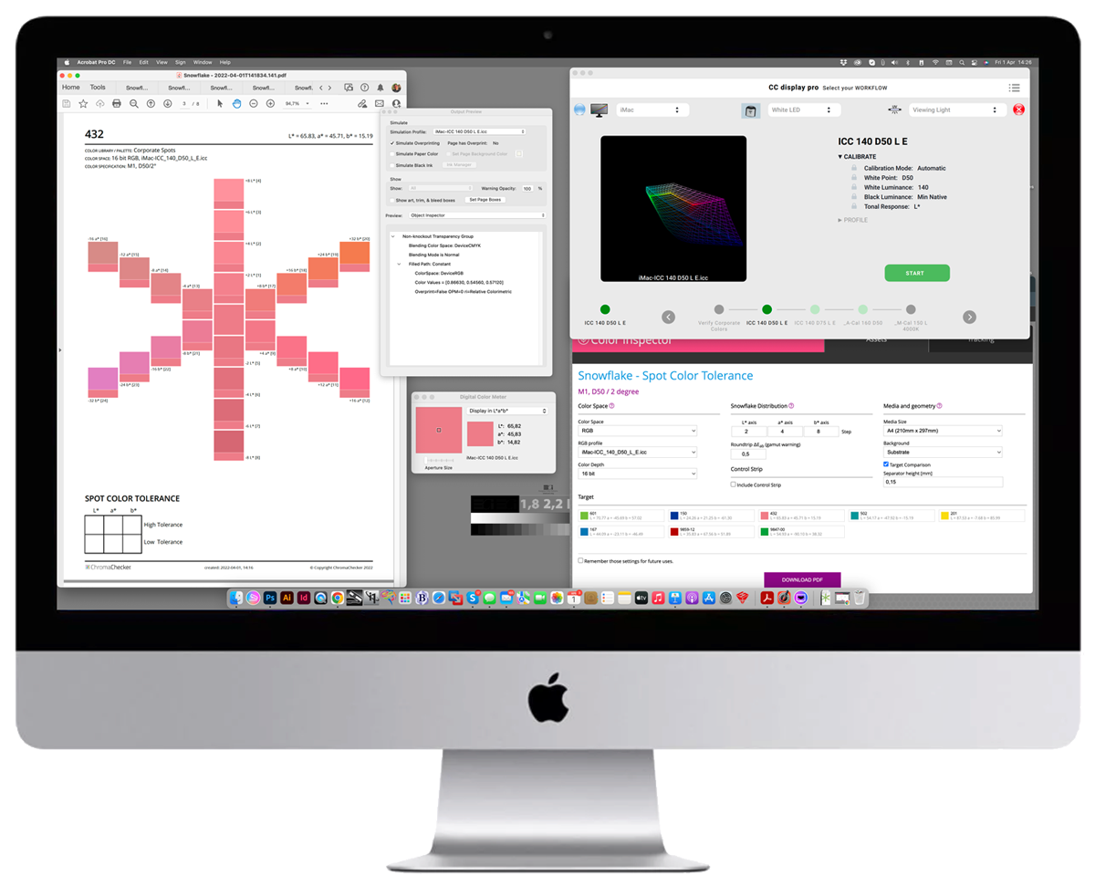
- The next step is to qualify printing - with Virtual Print Spot. To do that you need a high-quality Device ICC Profile. We have a dedicated page that guides the user on how to create it.
- Print a Snowflake and check how accurate Target is printed - use the tracking option of Color Inspector to do that. Measure with the instrument that will be used through the whole process. Be sure to profile your printing device with the same instrument!
- If you are not satisfied with the results - print Grid and based on the selected patch create a substitution Color Palette where "fake" Lab coordinates will print samples (Target Lab values) as expected
- If Target is acceptable Print Snowflake and evaluates it visually. Measure values on 6 axes of the Snowflake to use real values (addressed in PDF might be printed with some deviations.
- Enter measured values into ChromaChecker Library. DONE!
Additionally, you may export tolerances to X-Rite eXact, or learn how you can apply different tolerances for the same color sample using ChromaChecker features
You have to understand your Printing System
The critical part of the solution is to select settings that give the best control on the accuracy of color reproduction. Depending on hardware/software configuration some important decisions have to be made. Most of them are related to how the patches should be addressed in the PDF file. ChromaChecker offers different PDF Color Spaces (see related documents).
Contact ChromaChecker Support
Additional information and Support Form is available for logged users.