Visual Assessment in Numbers
Color perception is subjective — it depends on lighting, the individual observer, and personal experience. ChromaChecker removes that subjectivity by translating visual judgements into measurable numerical values that the entire production team can work to consistently.
From Quality to Numbers
The ChromaChecker approach follows a clear four-step path:
Instead of relying on individual visual judgment, you define what “acceptable” means numerically — using ΔE tolerances, Snowflake profiles, and industry standards. Every measurement is then automatically evaluated against those numbers, producing a clear pass or fail result. This removes ambiguity from press approvals, client sign-offs, and production QC.
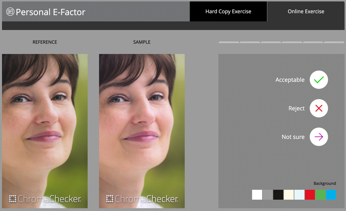
The E-Factor — Quantifying Individual Perception
The E-Factor (Evaluation Factor) measures how sensitive a specific person is to color differences. Because human color perception varies between individuals due to physiology, experience, and context, the E-Factor establishes a personal and organisational baseline.
Practical applications:
- Qualifying press operators for critical color-matching work
- Setting tolerances that reflect real human perception limits, not arbitrary ΔE values
- Training and education for color QC teams
- Documenting the perceptual standard your organisation works to
Process Color vs. Spot Color
ChromaChecker handles two fundamentally different types of color evaluation, each with its own pass/fail approach:
Process Color (CMYK / ECG)
Evaluated against printing standards such as ISO 12647-2 or G7. The focus is on tone reproduction, gray balance, and ink density. Tolerances are defined per the standard and applied to scanned control strips.
Spot Colors (Brand Colors)
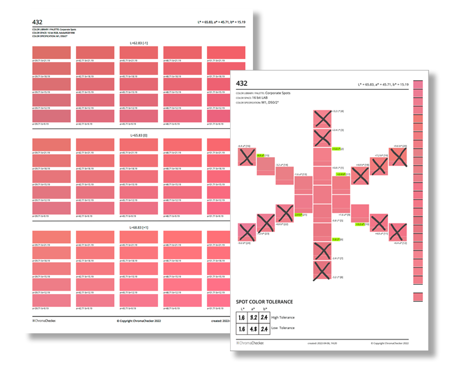
Evaluated against a specific target value (L*a*b* or spectral). The focus is on how closely a measured print matches the approved brand reference. Tolerances can be set per color, per palette, or using the Snowflake tool for directional tolerances that match human perception.
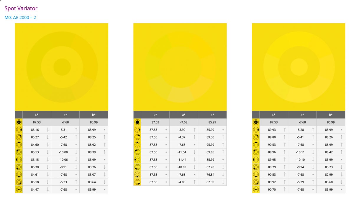
Visualising Color Differences
Before locking in tolerance values, it helps to see what a given ΔE looks like for real colors. ChromaChecker provides two tools for this:
- Color Variator — simulates how a ΔE shift looks for any selected color, helping teams agree on a tolerance before entering it into the system
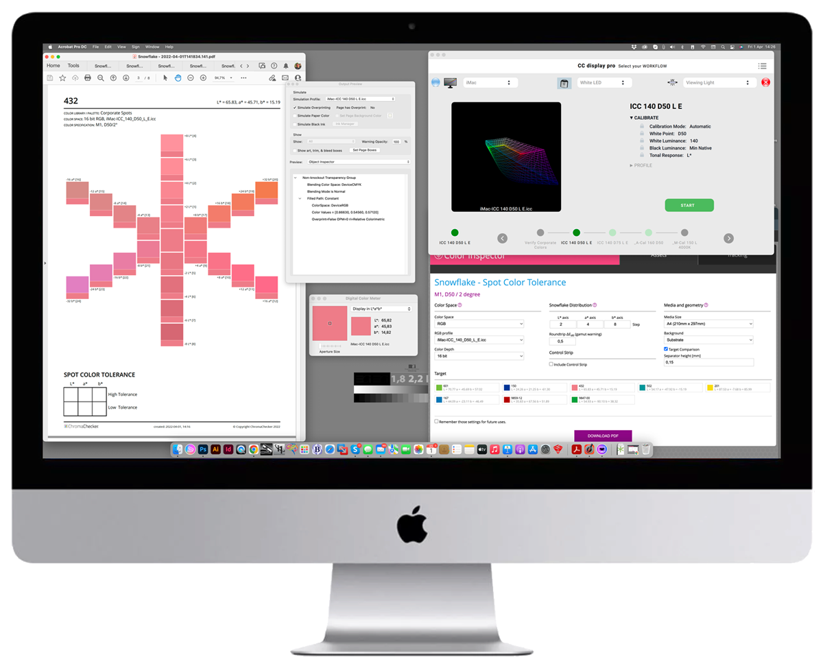
- Snowflake — visualises tolerance as a multi-axis shape, showing how acceptable variation differs across color directions (see Snowflake Tolerancing)